5 Things That You Should Never Put On Your Real Estate Signage
It is tempting to believe that traditional forms of marketing should concede to the power of the internet. After all, we spend much of our lives online. We can use powerful search tools to find pretty much anything we need or desire. Yet, studies have shown that print signage still has a considerable amount of influence, particularly when it comes to real estate.
Property signs continue to be essential for many reasons. The first is that a surprising amount of people still use real estate signage as their main search tool. The second is that even those who search for properties online usually pay attention to real estate signs as well. So, they can have a big impact and estate agents should be taking the time to create attractive, eye catching designs.
This guide to avoiding the common pitfalls of property signage will help your real estate business stand out from the crowd.
Overly Small Fonts
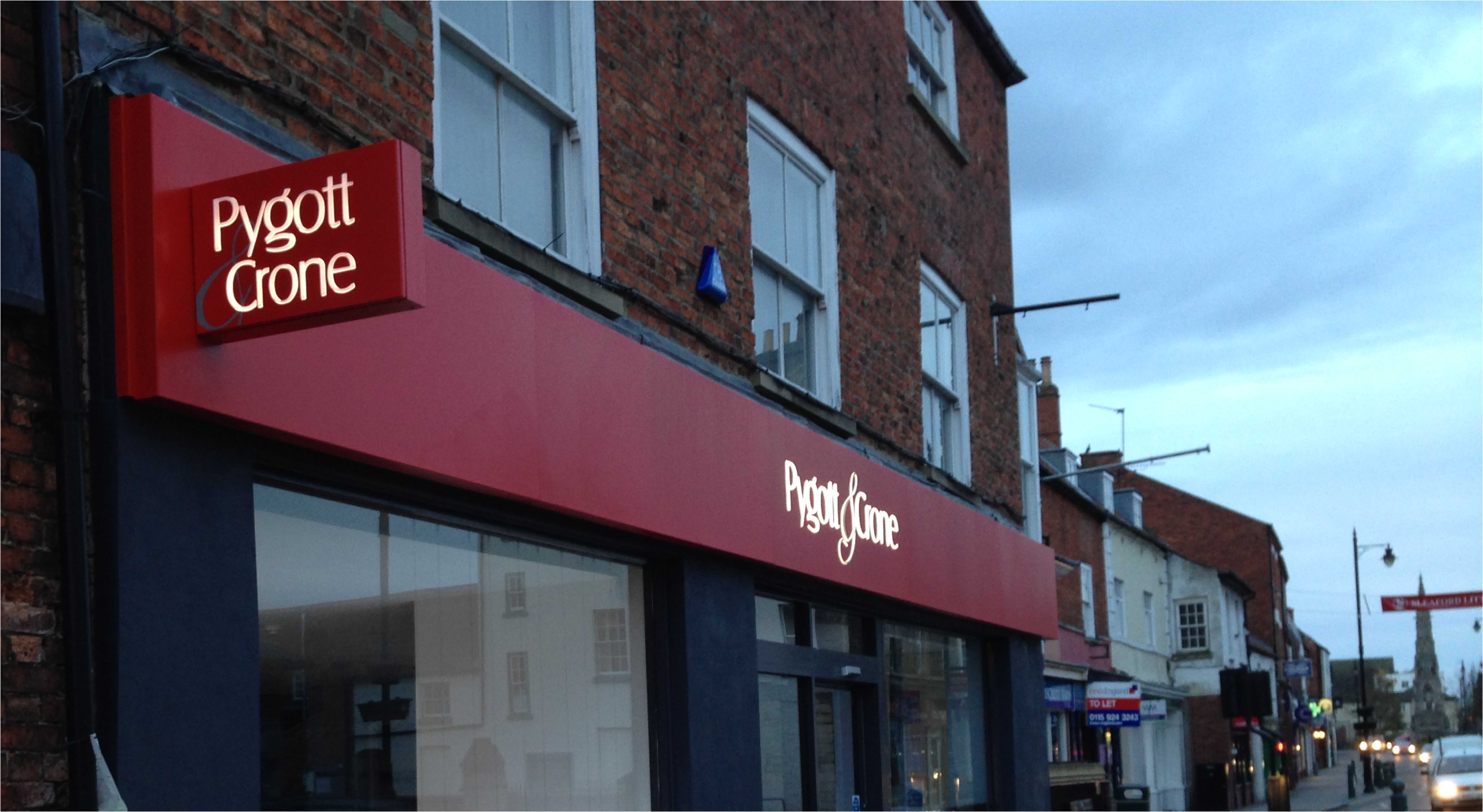
The people most likely to notice real estate signs are drivers or people travelling in cars. So, anything which cannot be read at a reasonable distance is no good for your advertising. High quality property signs in Colchester are striking, engaging, and able to convey a message in few words. The general rule of thumb is that your headline should be readable in no more than 3-4 seconds. If it takes any longer, a passer-by is unlikely to remember it.
Too Much Information
The same guideline applies to the amount of text that you place on your signage. Remember that it isn’t designed to ‘sell’ the property. It is there to alert potential tenants of its availability and let them know that your business is the place to secure it. The most essential pieces of information are your company name (which should be very prominent), your telephone number, and your web address. It is also a good to include a key feature, such as the number of bedrooms or bathrooms.
Space Hungry Sales Pitches
You only have a small amount of space in which to convince people to enquire about the property. Therefore, the best real estate signs in Colchester don’t waste room on redundant sales pitches. Statistics show that most tenants don’t consider the agent when making a choice. Unless they have had a bad experience with a particular agent, they don’t mind who they work with. So, marketing via property signage isn’t very effective for business anyway.
Clashing Colours
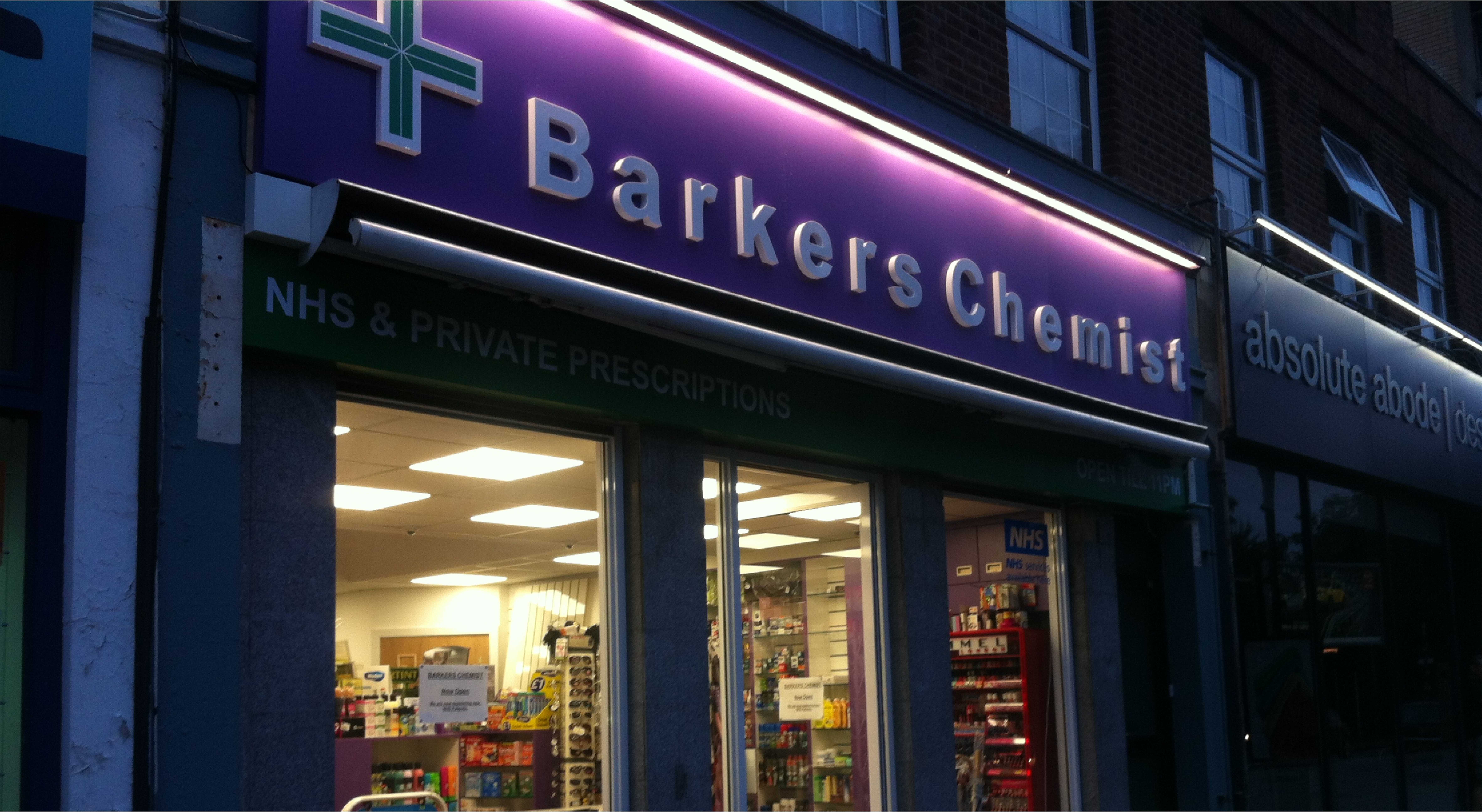
While bright tones are a good way to get your signs noticed, you’ve got to pick the colour scheme carefully. Complementary shades are key because some colours will clash and make it hard to read the text. When creating your signs, it is a good idea to do some research on complementary colours and colour wheels. Or, you can find a reliable provider of signs in Colchester and ask for them professional design advice.
Large Pictures
Ironically, photographs aren’t usually a beneficial addition to real estate signs, even though they form a vital part of the selection process for customers. They take up lots of space, are difficult to see properly at a distance, and they don’t translate well out of context. For instance, a single picture of a bedroom, kitchen, or garden doesn’t mean much without other images to compare it to. Leave the photographs on your website, so that potential tenants can peruse them in their own time.
For more advice on designing real estate signs in Colchester, visit EnviroSigns. Or, call 01206 845 515 to speak to a sales advisor and discuss your marketing needs today.


