How to Develop an Engaging, Effective Design for Your Commercial Hoardings
Commercial hoardings are a form of conventional print advertising. They are much like magazine ads or flyers, only they are supersized. They appear most often at the side of motorways and highways or on the tops of buildings. Most airports and other large-scale public buildings also contain hoardings, so they have the potential to get a brand to a huge number of consumers.
This is why they’re a popular choice for businesses of all shapes and sizes. They’re relatively cheap to design and produce and they can be placed in areas that smaller print media cannot. However, in order to be effective, your high-quality hoardings in Essex must be engaging. They have to catch the eye, fire up the imagination, and get shoppers thinking about your brand. To achieve all of this, you need to create the perfect design.
This guide to designing commercial hoardings that drive traffic to your business will give you some helpful tips.
Keep It Simple
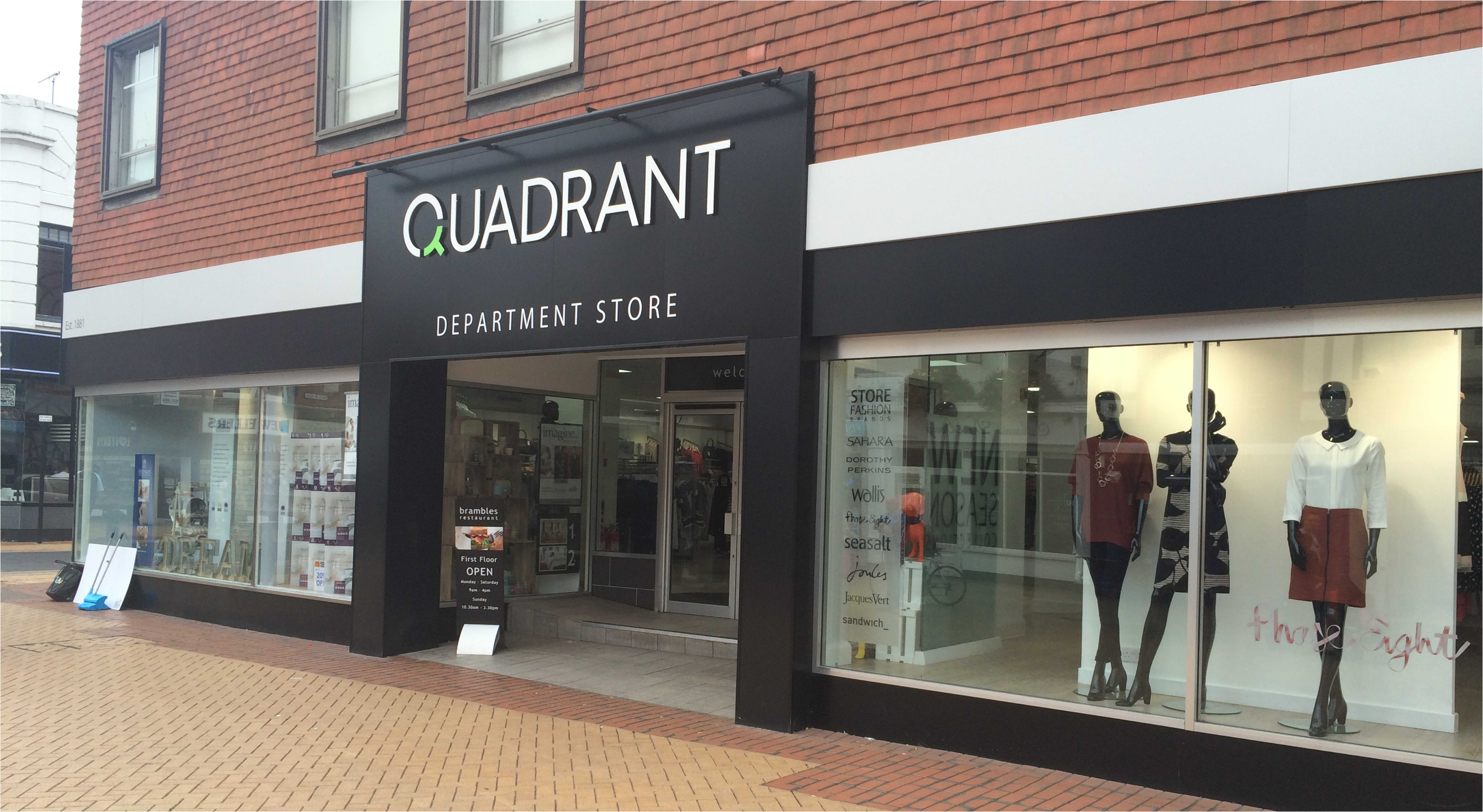
The most common place to position commercial hoardings is at the side of the motorway. Clearly, nobody is going to stop to read the small print or get out for a closer look. So, you need to get your message across in as few words as possible. The best hoardings in Essex are bright, eye-catching, and bold, but they don’t rely on text. Between 6-10 words is ideal, as they’ll have to be printed larger, in order to be seen by passing consumers.
Pick Your Font with Care
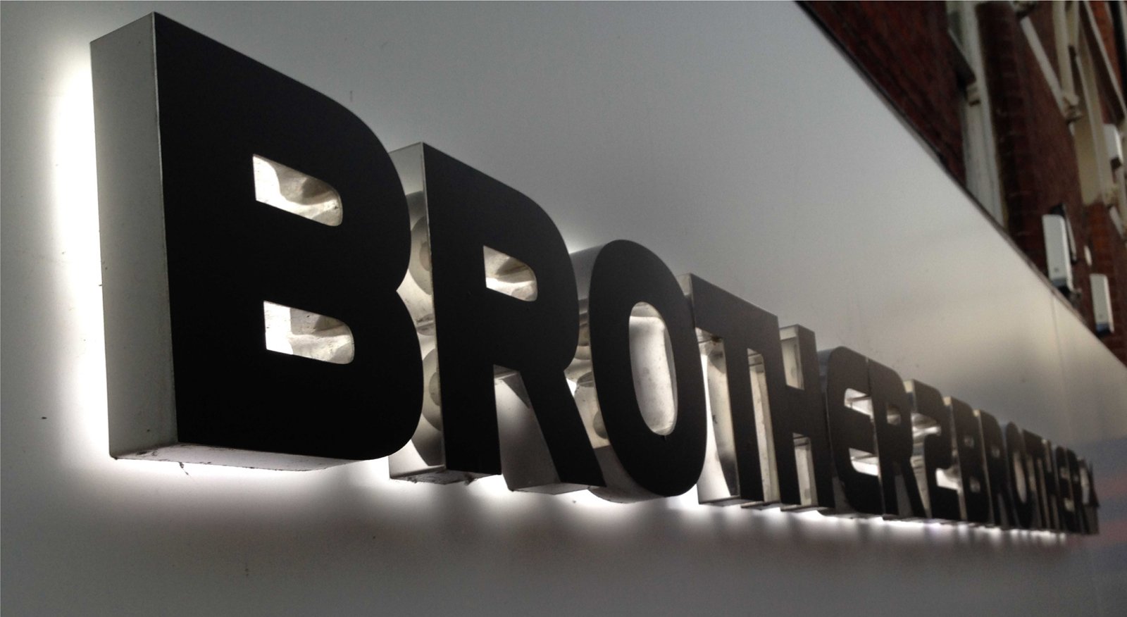
As already mentioned, the text on a hoarding has to be substantially bigger than it would be on a poster or flyer. Contrary to popular belief, it is actually harder to read the text in all caps (particularly while moving) than it is to read upper and lowercase type. So, keep this in mind when choosing a suitable font. You need to test the readability of the design from a distance before you send it to the printers. Think about small details like word spacing; for example, should the spaces be slightly larger than normal to accommodate for reading at a distance?
Use High Contrast Colours
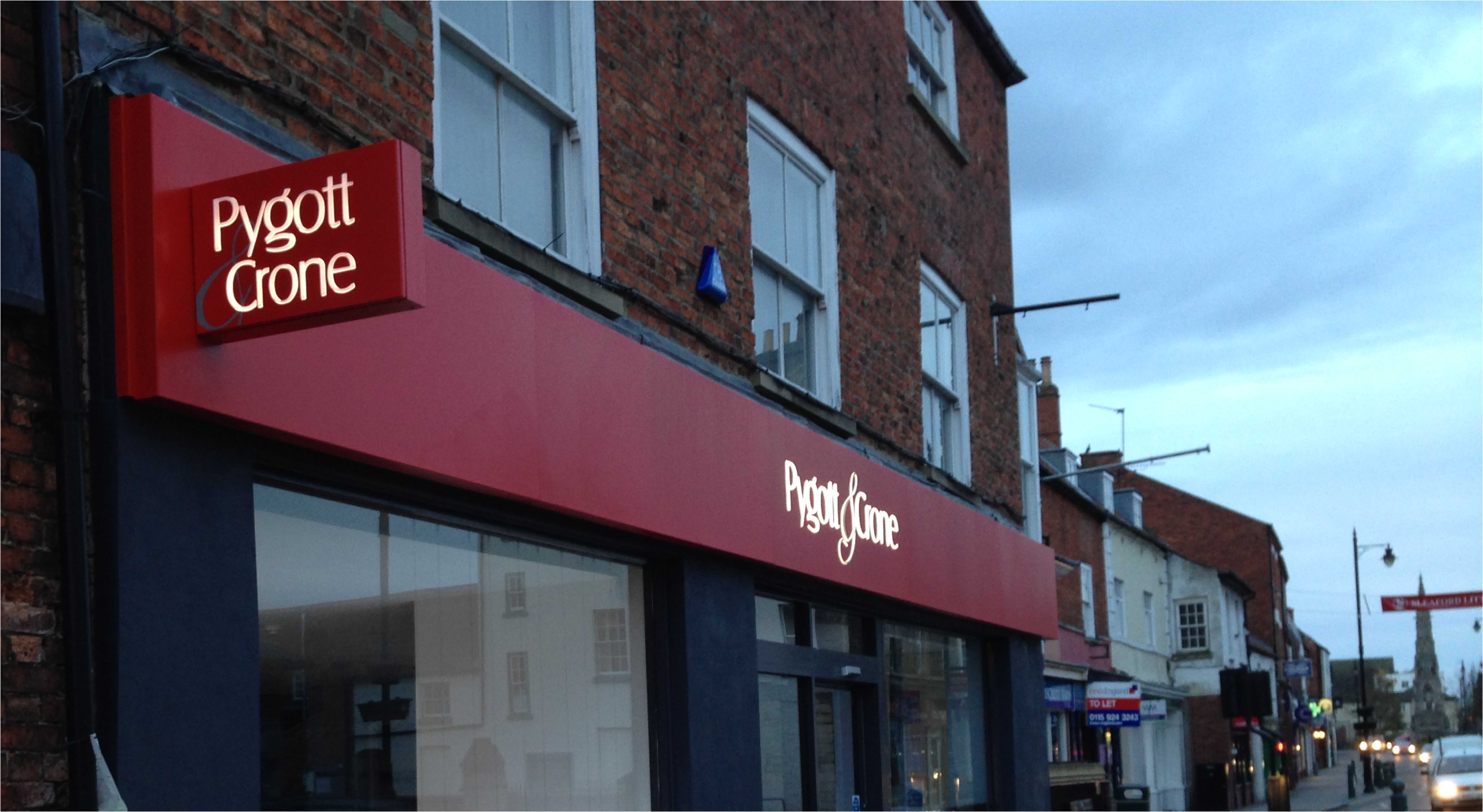
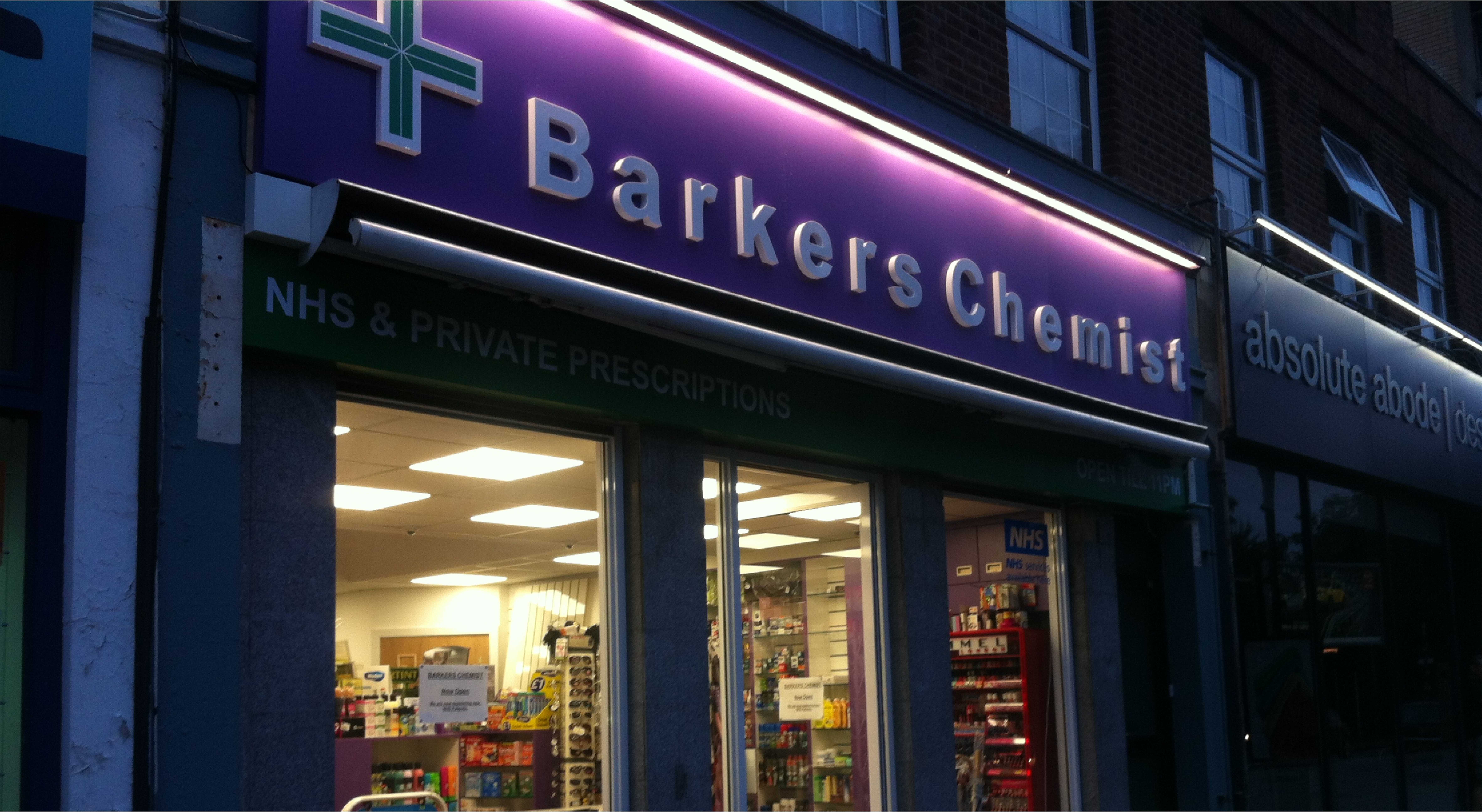
When designing striking commercial hoardings in Essex, you need to use bold colours that complement one another. For instance, if you were to use a yellow background and a white font, you’d be using bold tones, but they’d cancel one another out. You can test this for yourself. The colours don’t work together and the white is almost impossible to read. Don’t send your final design to the printers until you’re certain that all of the colour components can be clearly interpreted and your text is functional.
Seek Advice from the Experts
If your company has little or no experience with hoardings at this point, you might find it a little difficult to master the design process at first. It does take practice because conventional advertising is all about saying as much as possible. On a hoarding, the aim is the same, but the method has to be much more concise. So, don’t hesitate to draft in an expert team for help and advice. There are all kinds of great print design agencies that can put together a great design on your behalf.
For more help and advice on designing effective commercial hoardings, click here to visit Envirosigns today. Or, call 01206 845 515 to speak to a representative and discuss your advertising needs directly.

